“U-u-u, I love Khreshchatyk so much!” – did you just sing this line in your head mimicking the voice of Ukrainian pop singer Dzidzio? 😉
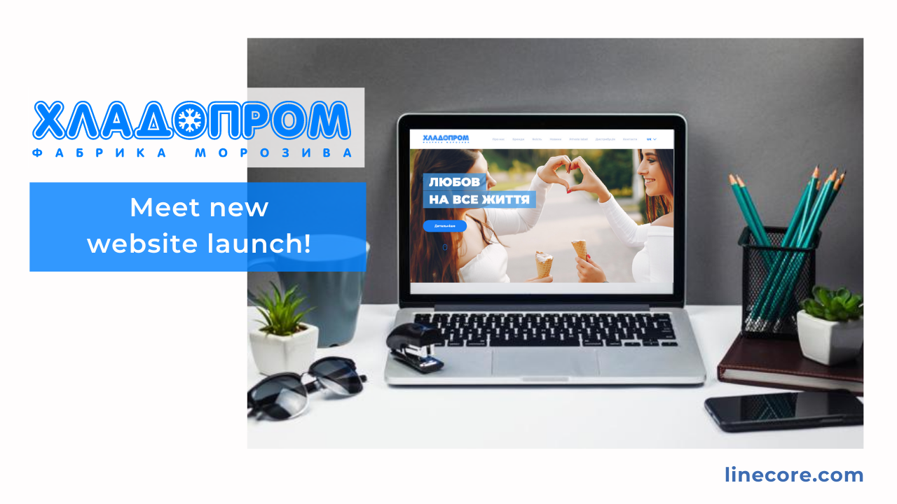
What do Khreshchatyk and Kashtan have in common? Hladyk and Vivat, Voloshkove Pole and Zlakomka? Of course, yes, all these are the brands by Khladoprom Ice Cream Factory! And today we are happy and proud to present you the new Factory website, developed by the Linecore team.
But let’s not run ahead! After all, our work began long before the new website.
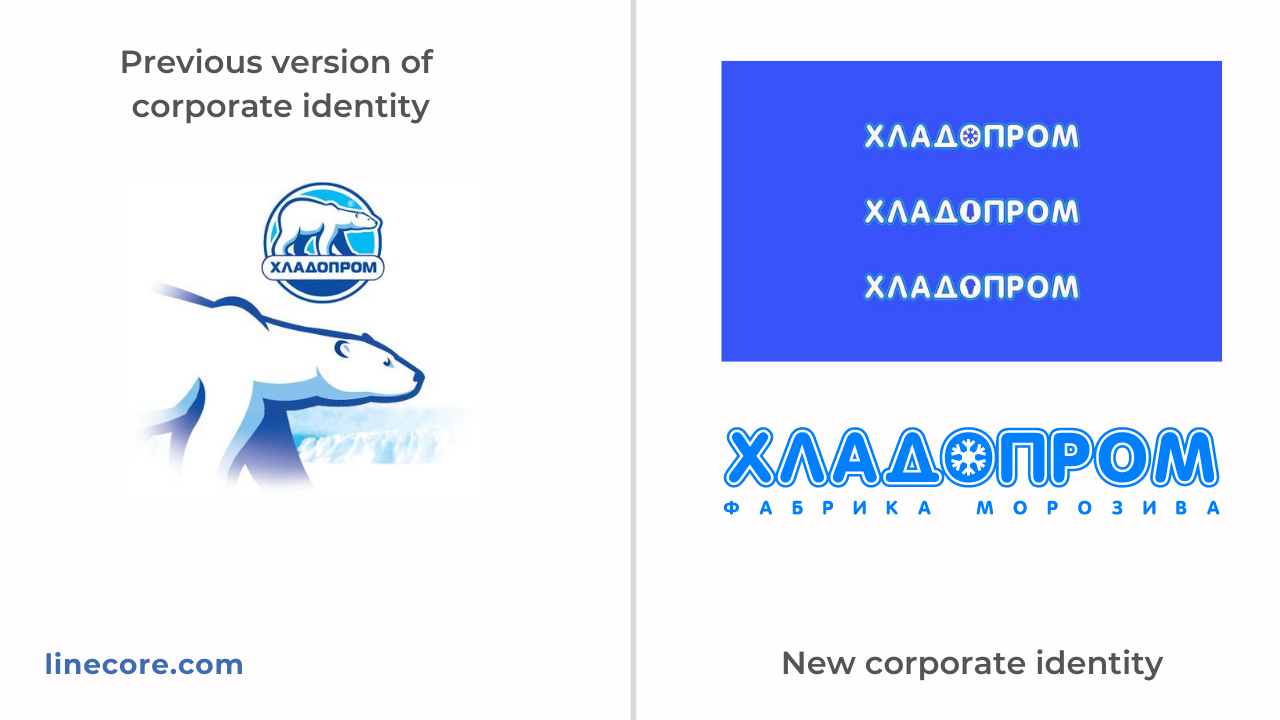
How to make a manufacturing company closer to the consumer? How to make the brand name memorable for the international market? How to gently transition from the logo in the style of the early 2000s, while maintaining the brand image?
These are the tasks our designers faced. The first stage was the development of corporate branding. We kicked off the work, and dozens of options later, after many brainstorms, stylized frosty patterns, wheels, popsicles and horns, ice cream sticks, the perfect version of the logo was born. It combines product orientation, ease of recognition, reserved style and “zest” – a snowflake as a clear and unobtrusive pattern.
Then we had an equally interesting and engaging part of the work: design of the new site based on the based on the new corporate style.
An interesting fact: Work on the design of the site began with a trip to the store. We bought a couple cups of Khreshchatyk ice cream, cut them in half (do not be afraid, purely for research purposes) and took photos to create the perfect “delicious” 3d-model!
Customer liked this idea a lot, and the 3D model of Khreschatyk ice cream went on to illustrate the product advantages on the website. Will you find it? https://www.khladoprom.com/
We developed the website structure that reflects the structure of the company’s business. Main information that needs to be broadcast to the target audience is presented on the separate pages: About us, Brands, Quality, Distribution, Private Label.
In the section “About us” we developed a timeline with the history of the company, showing the development of production from the 30s of the twentieth century to the present day.
“Quality” section takes the example of the flagship product, ice cream “Khreschatyk”, and explains the advantages over competitors using the3D model of a cup of ice cream that we’ve developed and animated.
We can talk extensively about all the features and techniques of the design, style or animation, since we’ve invested here all of our professionalism and boundless love (and quite a bit of modesty). Videos that lets you visit the manufacturing facility, numbers and reports, offers for distributors, brand presentations, bright photos and videos of the happy customers, full-screen banners, interactive navigation elements and non-standard solutions in presenting information – all this allows us to say with confidence: “Yes, the goals have been achieved!” The corporate website projects all the status of the brand, presents many years of experience, broadcasts the strategic vision of the company’s management and presents “Khladoprom” as a modern European company, pleasant to view, quite friendly and soooo stylish!
And what do you think?
